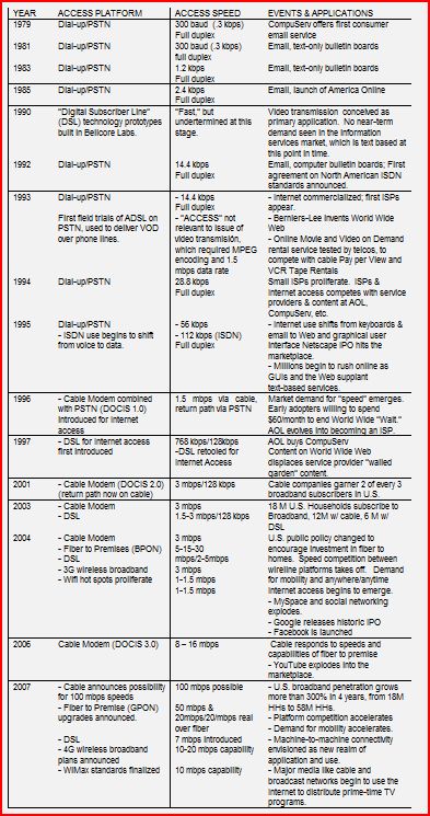
Very useful chart over on the Verizon policy blog put together by Link Hoewing and Larry Plumb. Link uses it illustrate the changes we have seen over the past three decades in terms of Internet access platforms and speeds. It’s too small to read here, so make sure to go there to see it more clearly and also see Link’s interesting discussion.

 The Technology Liberation Front is the tech policy blog dedicated to keeping politicians' hands off the 'net and everything else related to technology.