Any time I’ve heard government officials talk about the future of Recovery.gov, I’ve heard them mention maps. Maps that will let you drill down to your neighborhood and see the stimulus spending right around you. Well, the maps were rolled out last Thursday, and there was even a congratulatory press release from Vice President Biden. Tell me if you notice anything interesting in this map of federal grant recipients from Recovery.gov.
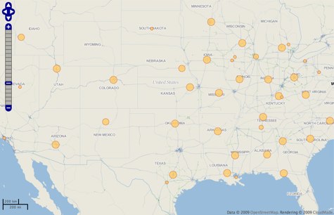
Geography wizzes will recognize that almost all the bubbles on the map, which represent federal grants, neatly coincide with state capitals. Check it out for yourself right here. What this highlights is a deeper problem of stimulus spending data: reporting is only required to go to two levels down. Sure, we can see that the Department of Education gave the state of California (displayed on the map as a bubble in Sacramento) so many millions of grant dollars. And we may even know that California gave a subgrant to the Los Angeles School Board. But what happens after that is missing, and will likely remain missing under the Act’s transparency requirements and OMB guidance.
These maps are great, but I’d rather have deep, meaningful data in a structured format so I can make my own maps.

 The Technology Liberation Front is the tech policy blog dedicated to keeping politicians' hands off the 'net and everything else related to technology.